CASE STUDY
Project Role Year
Personal Brand identity designer 2025
Background
In collaboration with the creative minds behind Google Doodles, our goal was to enrich the Google Search landing page with engaging and interactive experiences for users.
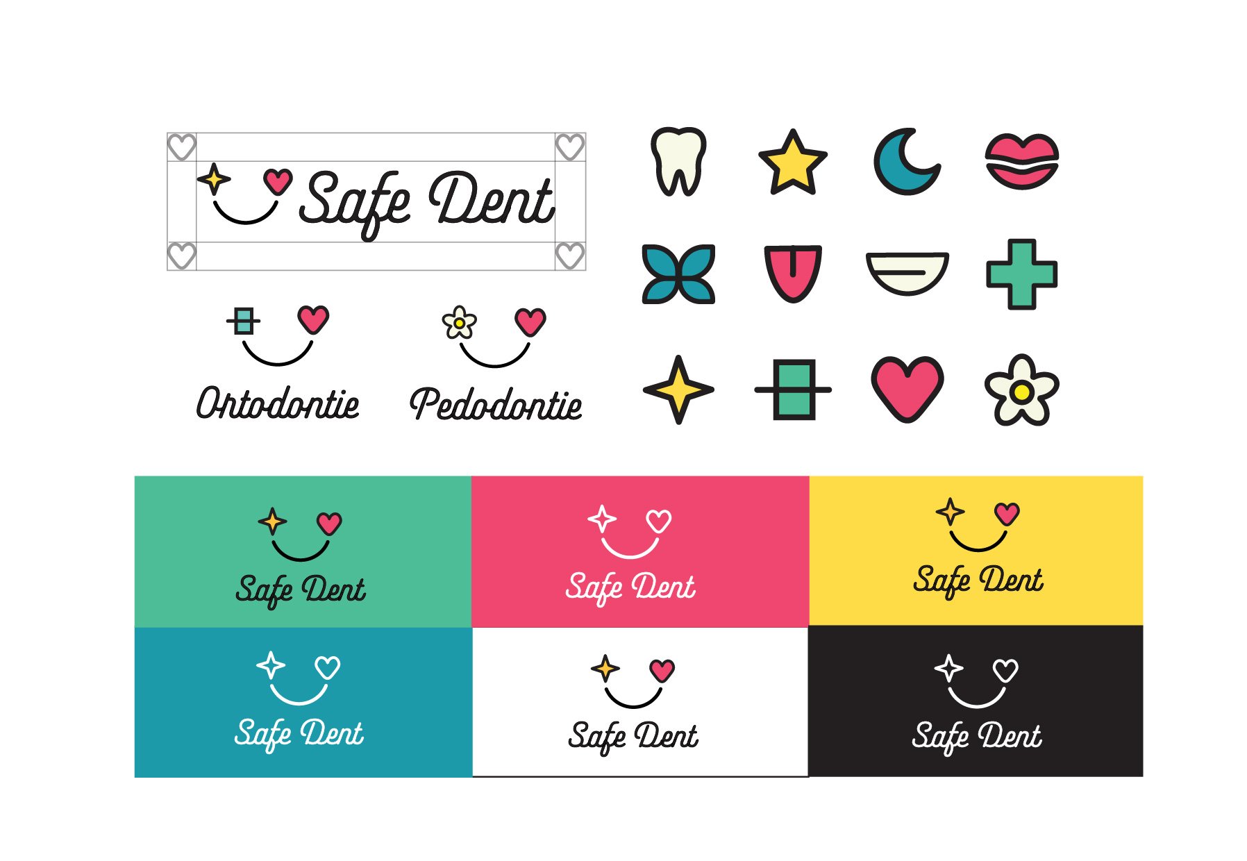
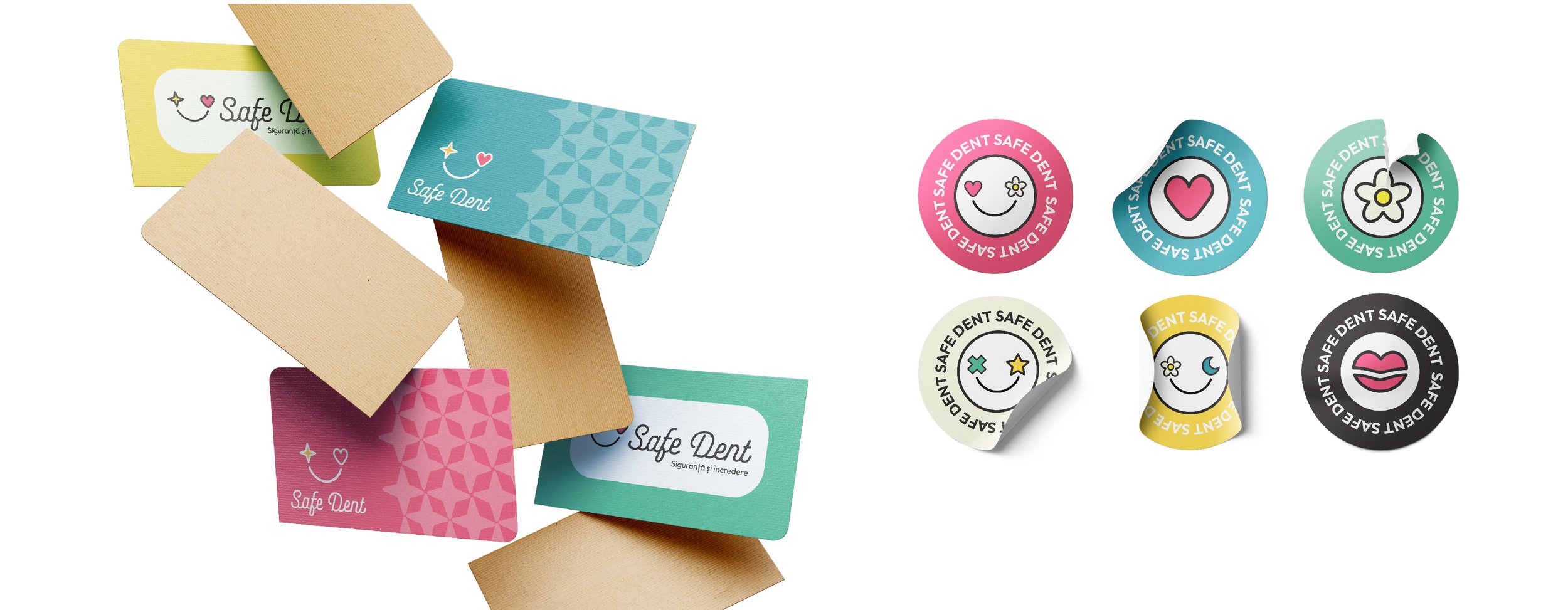
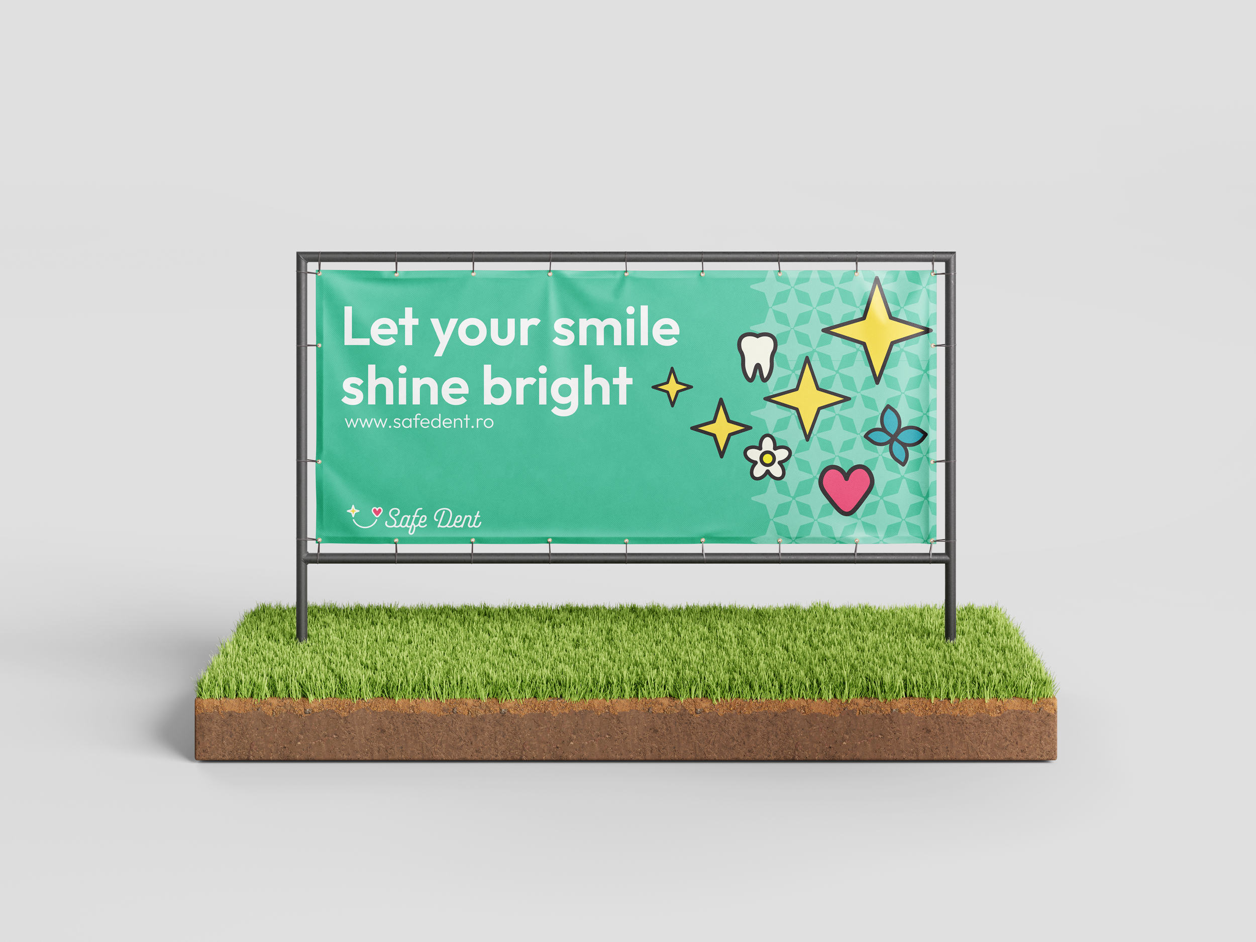
The color palette is a deliberate departure from the cold, sterile environment of traditional clinics. Yellow brings light and optimism, pink offers a sense of warmth and emotional comfort, while black ensures strength and contrast.
Together, they create a friendly, secure atmosphere that sets SafeDent apart from the market.
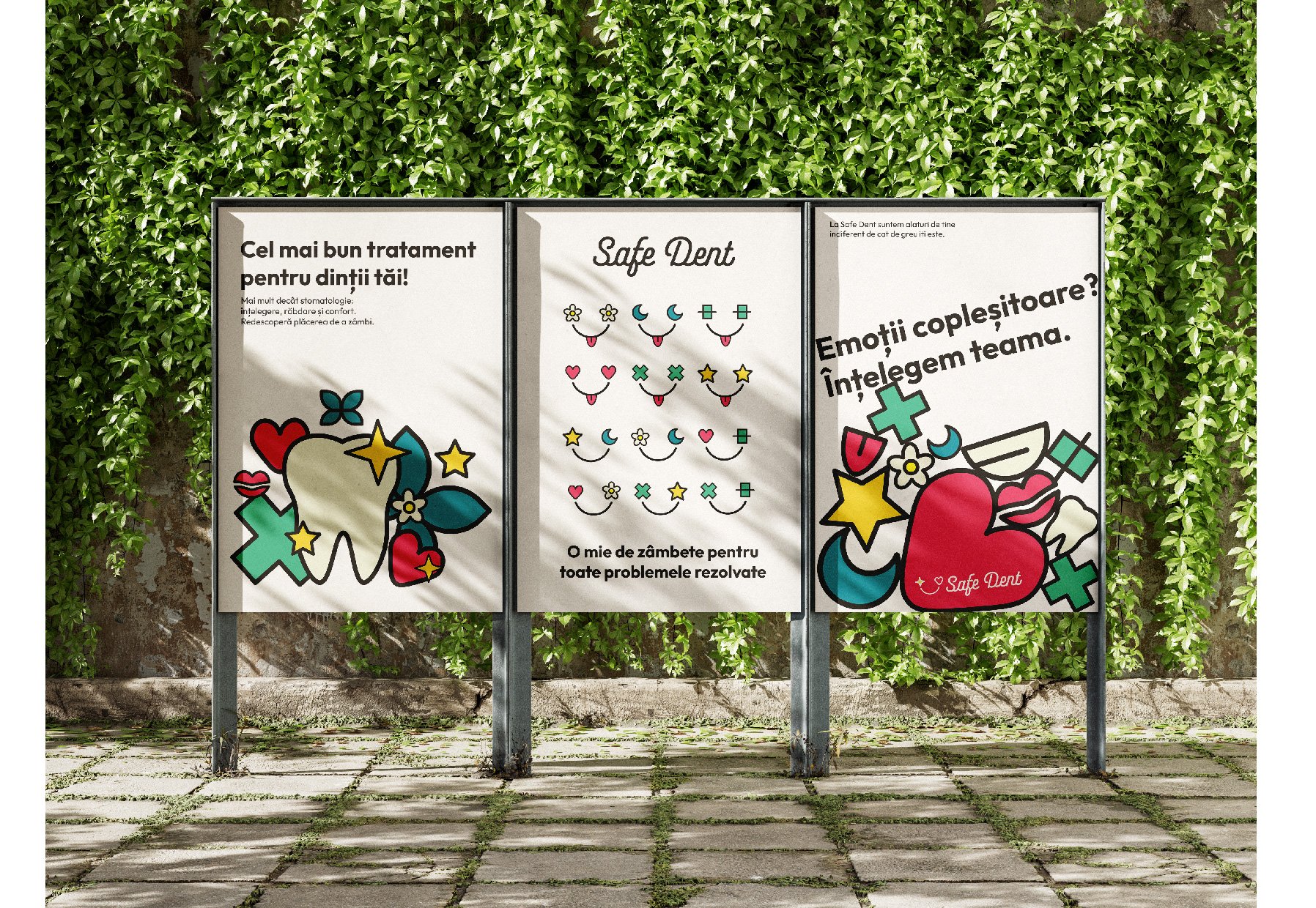
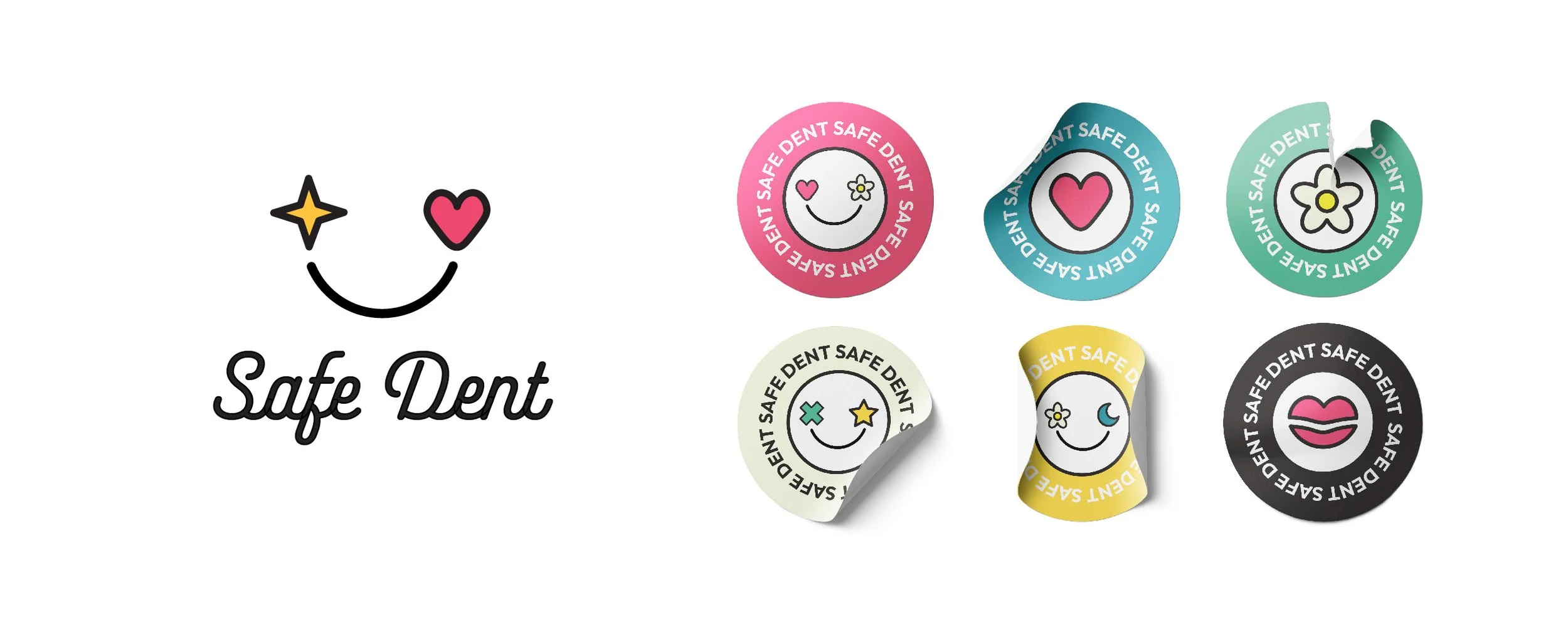
Safe Dent illustrations are built from a fixed base (the smile) and interchangeable eye elements derived from the brand’s symbols.
Their role is to replace cold medical aesthetics with a warm, empathetic visual language.
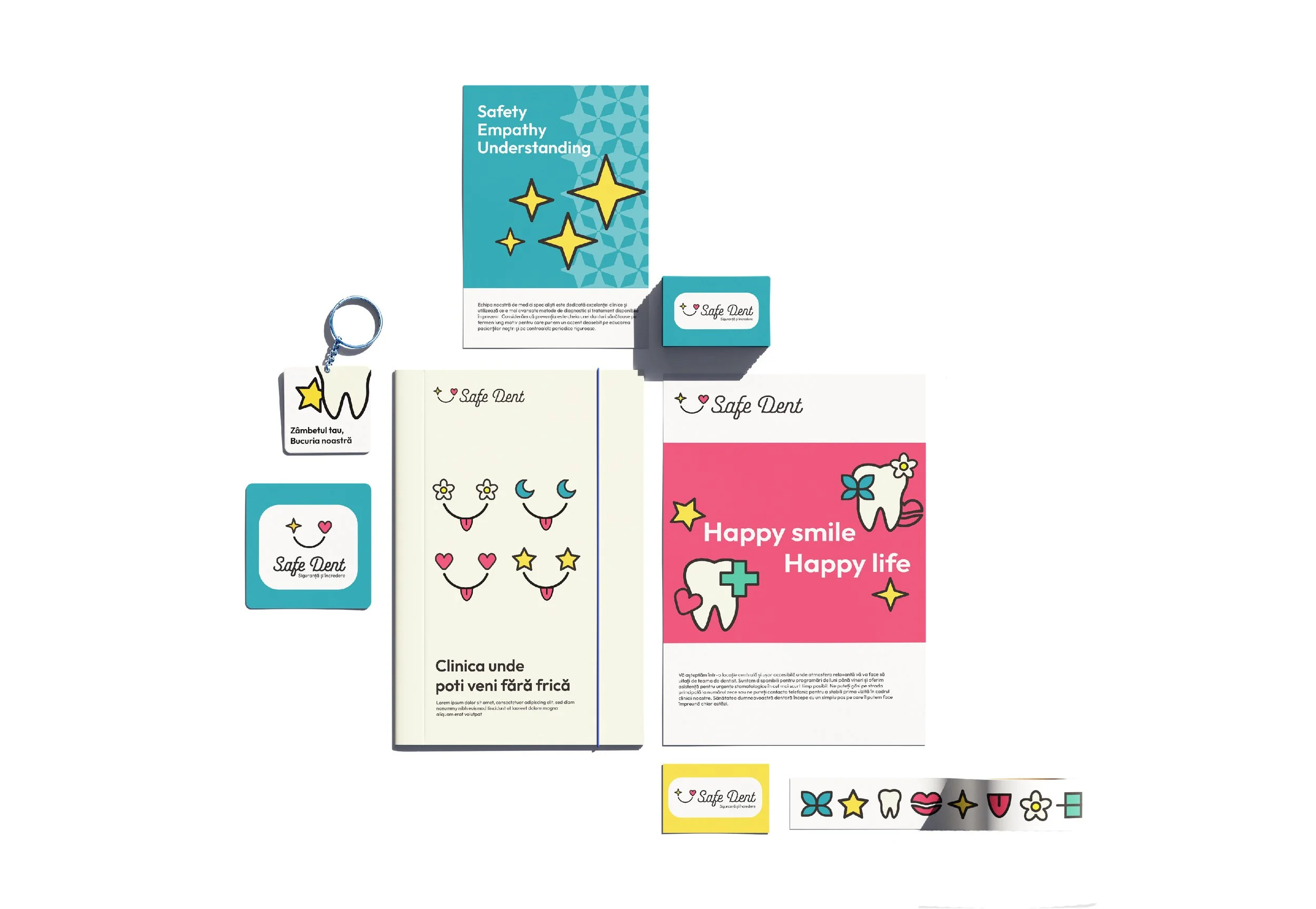
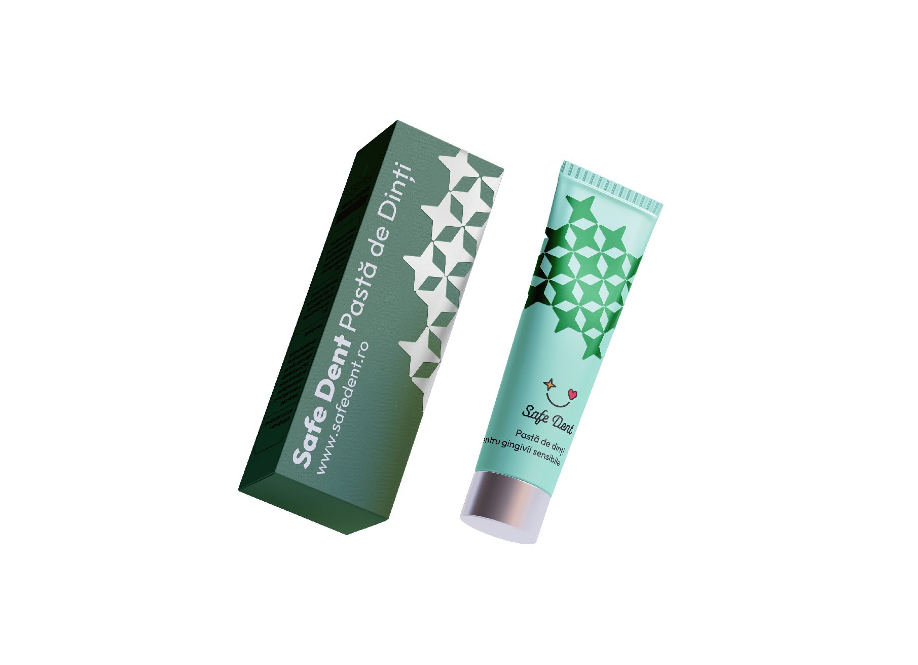
The goal is to transform dental anxiety into a sense of safety by providing a warm, patient-centered experience where emotional comfort is as vital as clinical excellence. By taking a different visual approach, we ensured that our goal is aligned with the voice of SafeDent.
Safe Dent
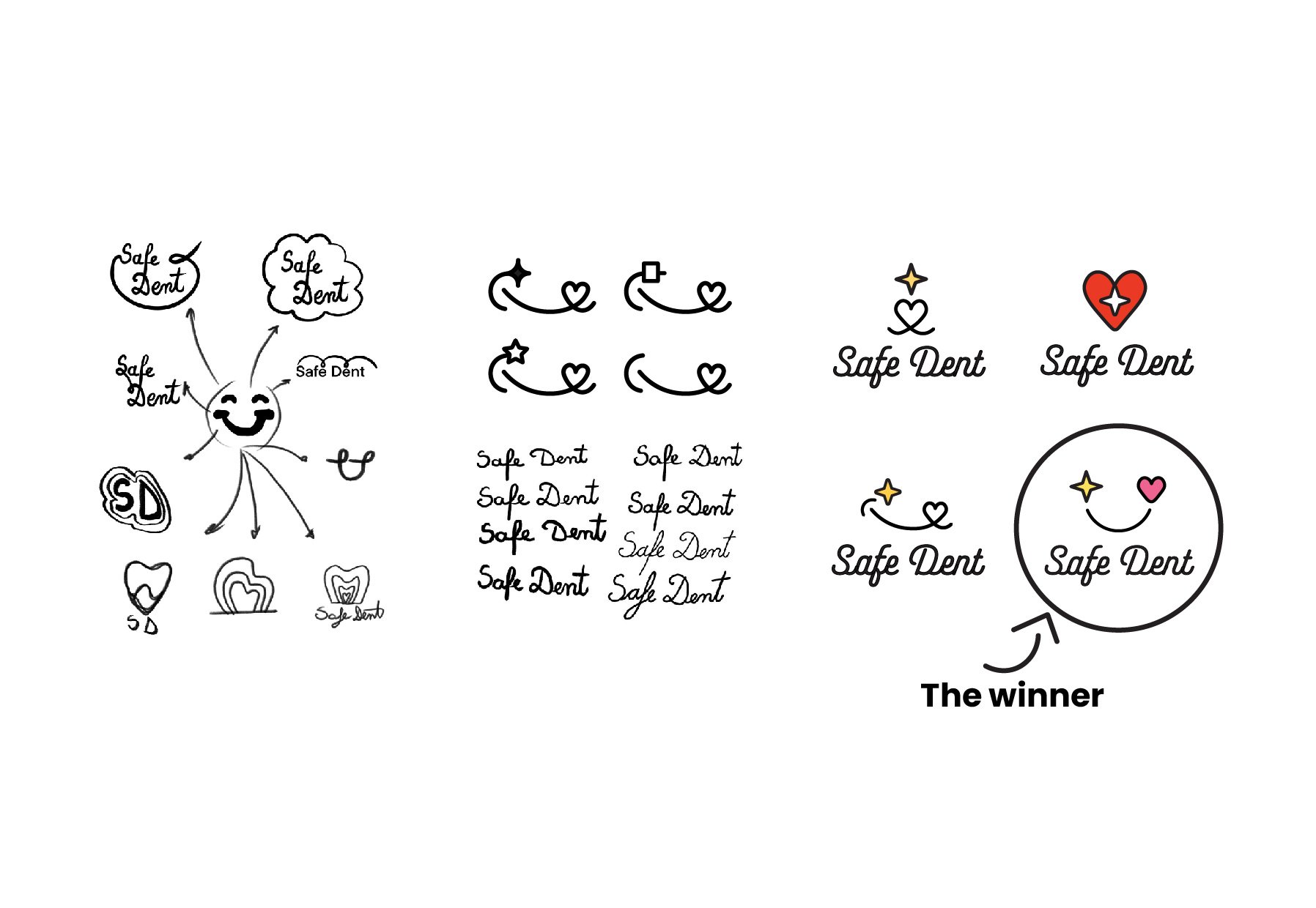
SafeDent was born from a desire to break dental clichés. Moving away from overused "smiling teeth" icons, we created a visual identity that is subtle, modern, and inviting.
Our goal was to replace clinical anxiety with an atmosphere of warmth and relaxation. More than just a clinic, SafeDent is a premium experience designed to redefine patient care and lead the market through sophisticated design.