CASE STUDY
Project Role Year
Non-commercial Brand identity designer 2025
Background
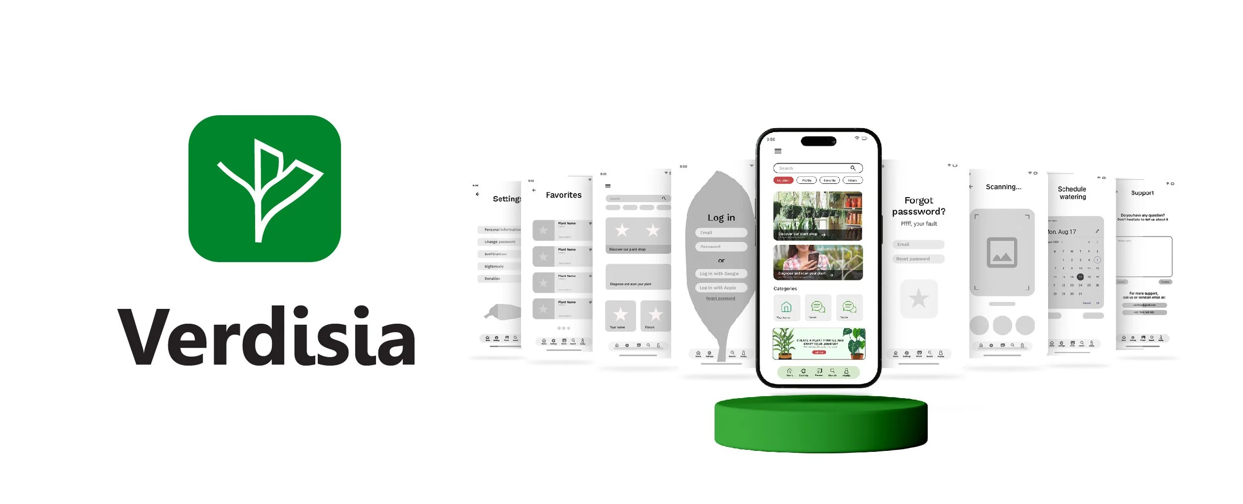
Verdisia is more than just a plant tracker. It's a vibrant, nurturing space where care, creativity, and connection grow together.
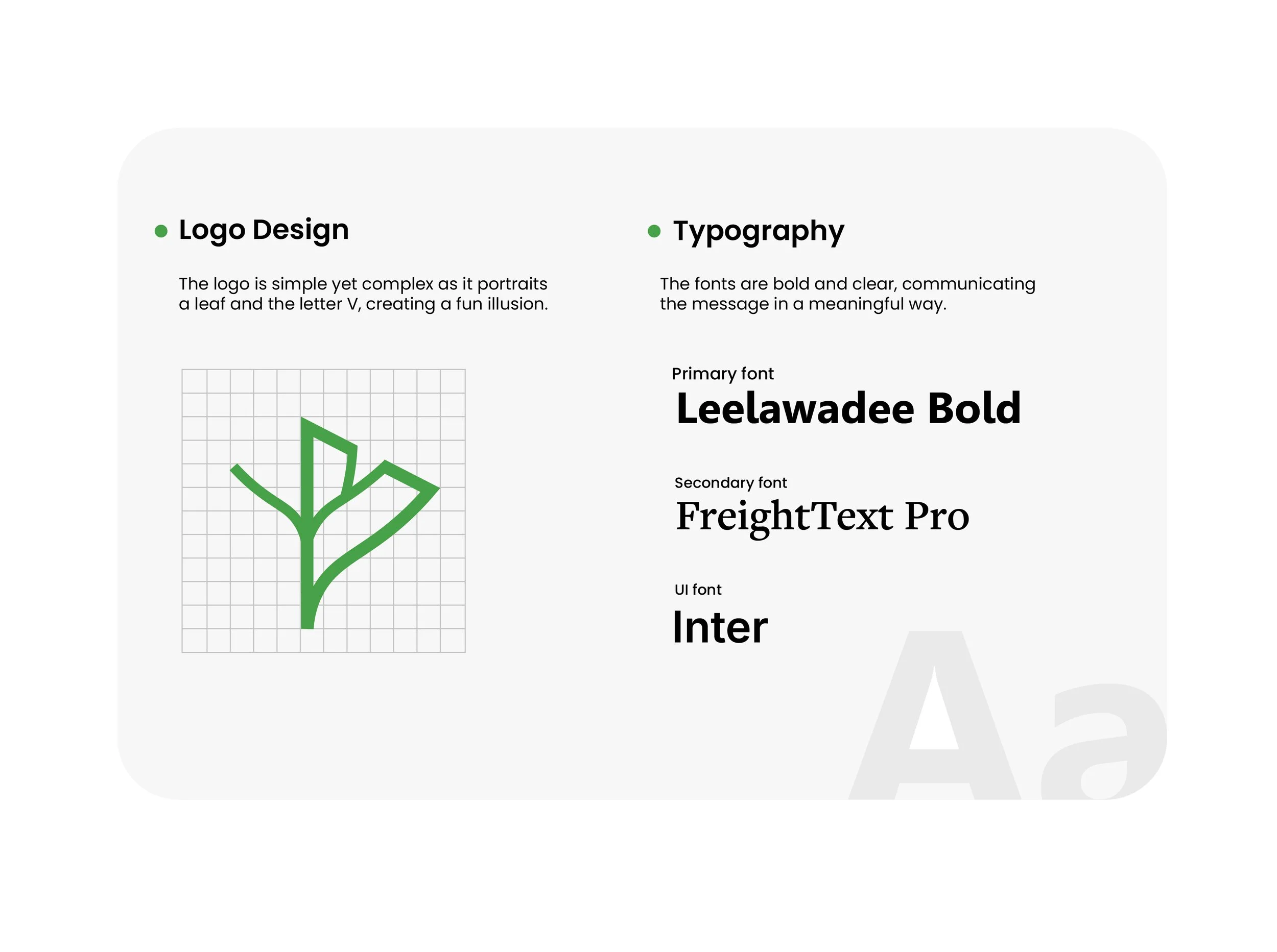
The Verdisia emblem is a fusion of a stylized leaf and a compass needle, symbolizing both growth and the guidance the app provides. Constructed on a strict geometric grid, the logo maintains structural integrity across all scales, from a tiny mobile icon to large-scale print materials.
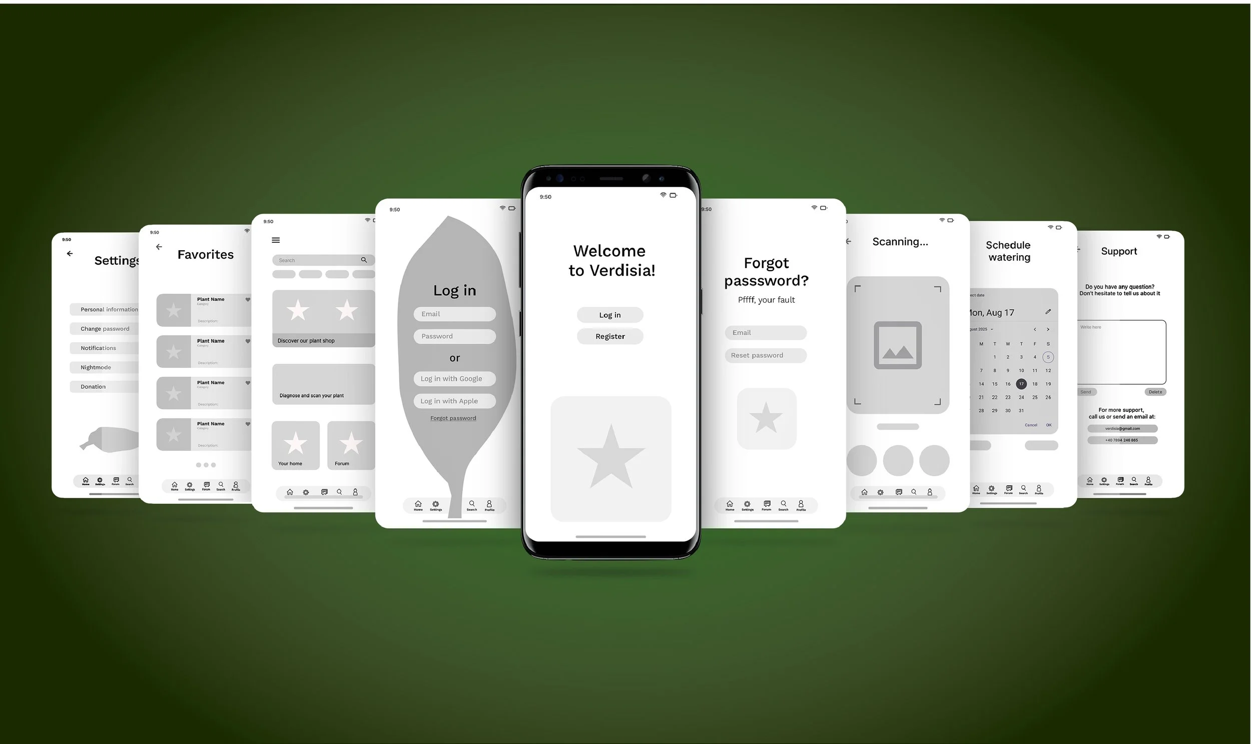
The unique "rewarding system" mentioned in the project overview is translated visually through progressive iconography. As users maintain their consistency
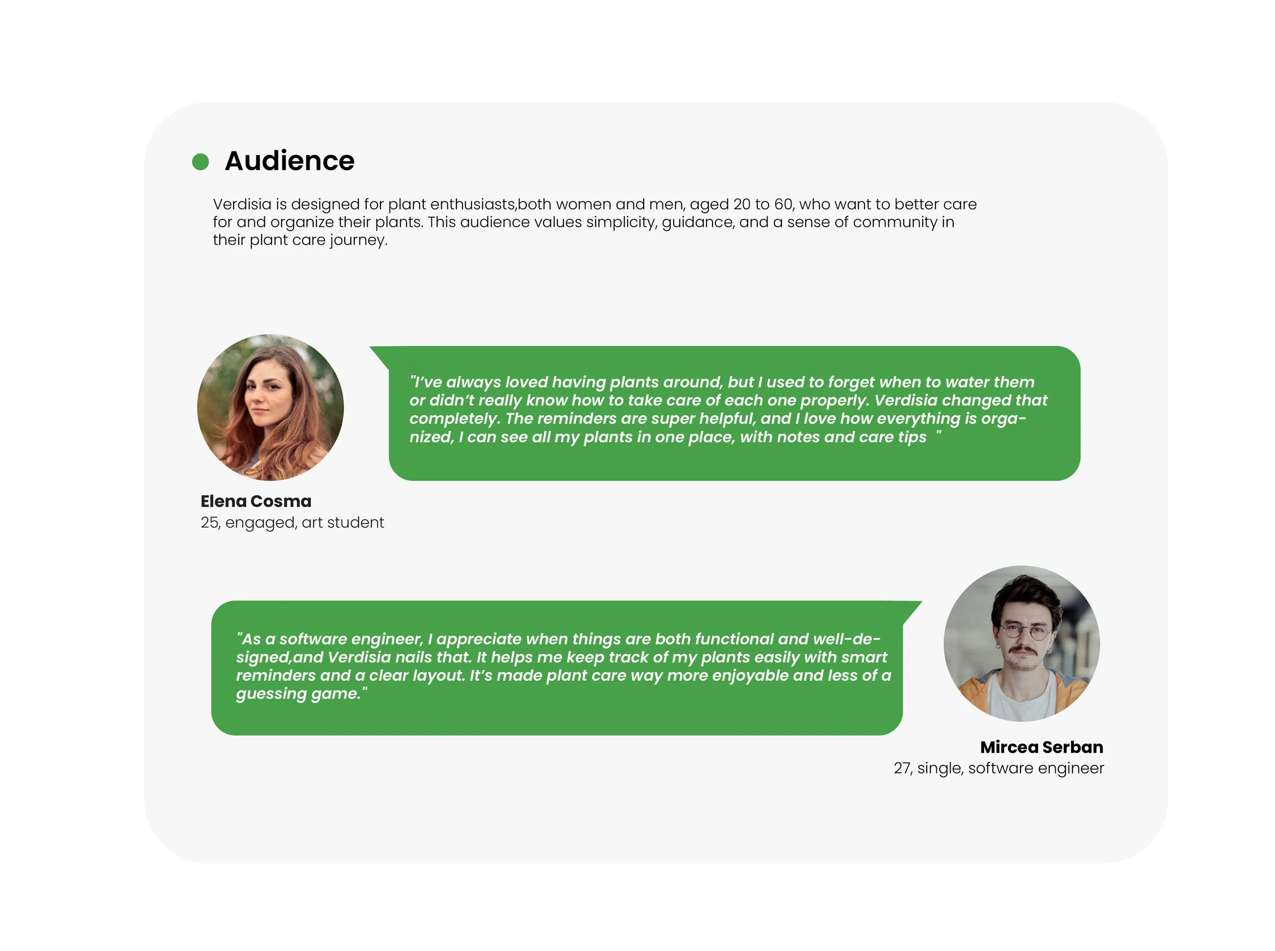
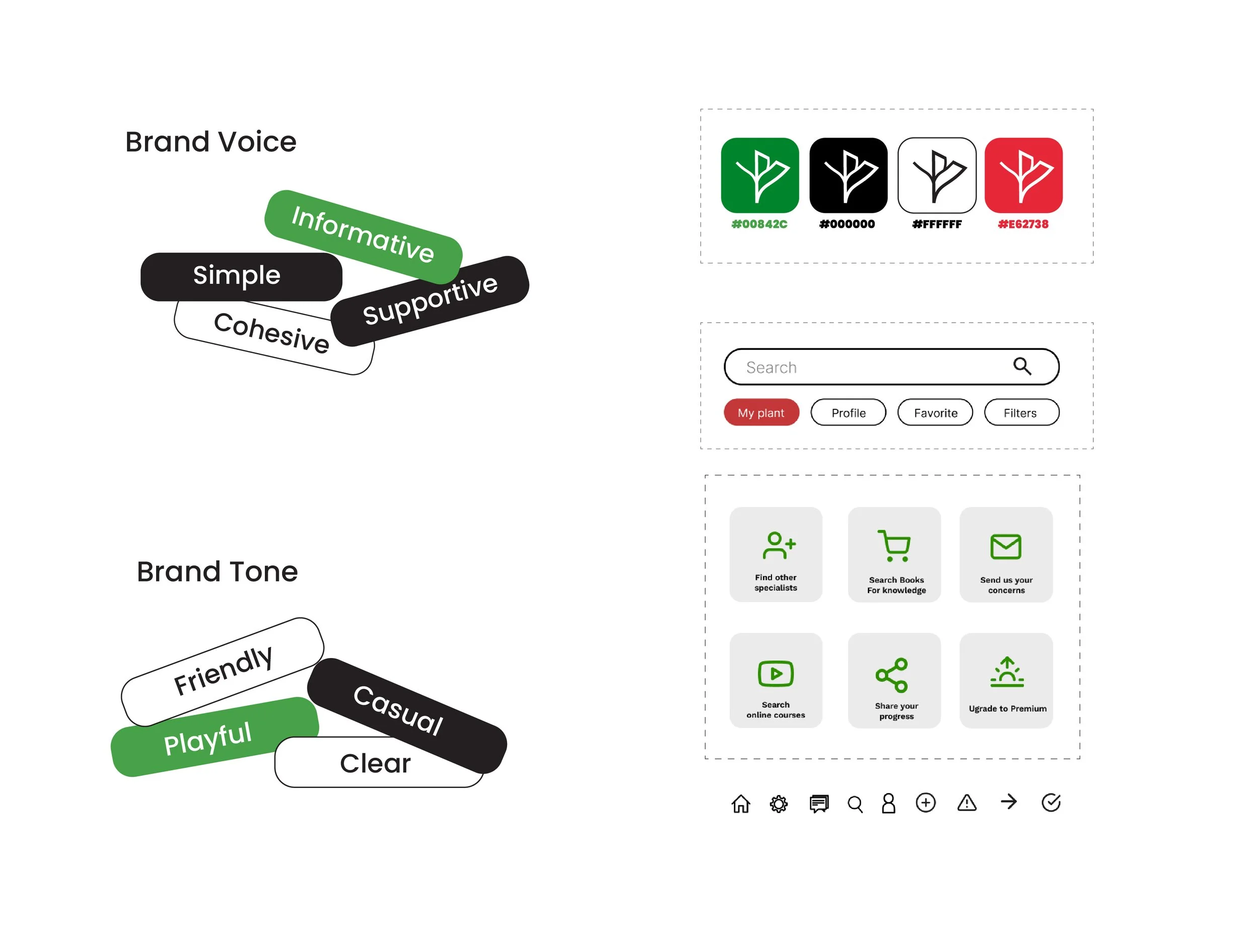
Ultimately, the visual identity of Verdisia is designed to grow with the user. It is a brand that values patience, celebrates small victories, and transforms the often-intimidating world of botany into a vibrant, accessible, and creative journey.
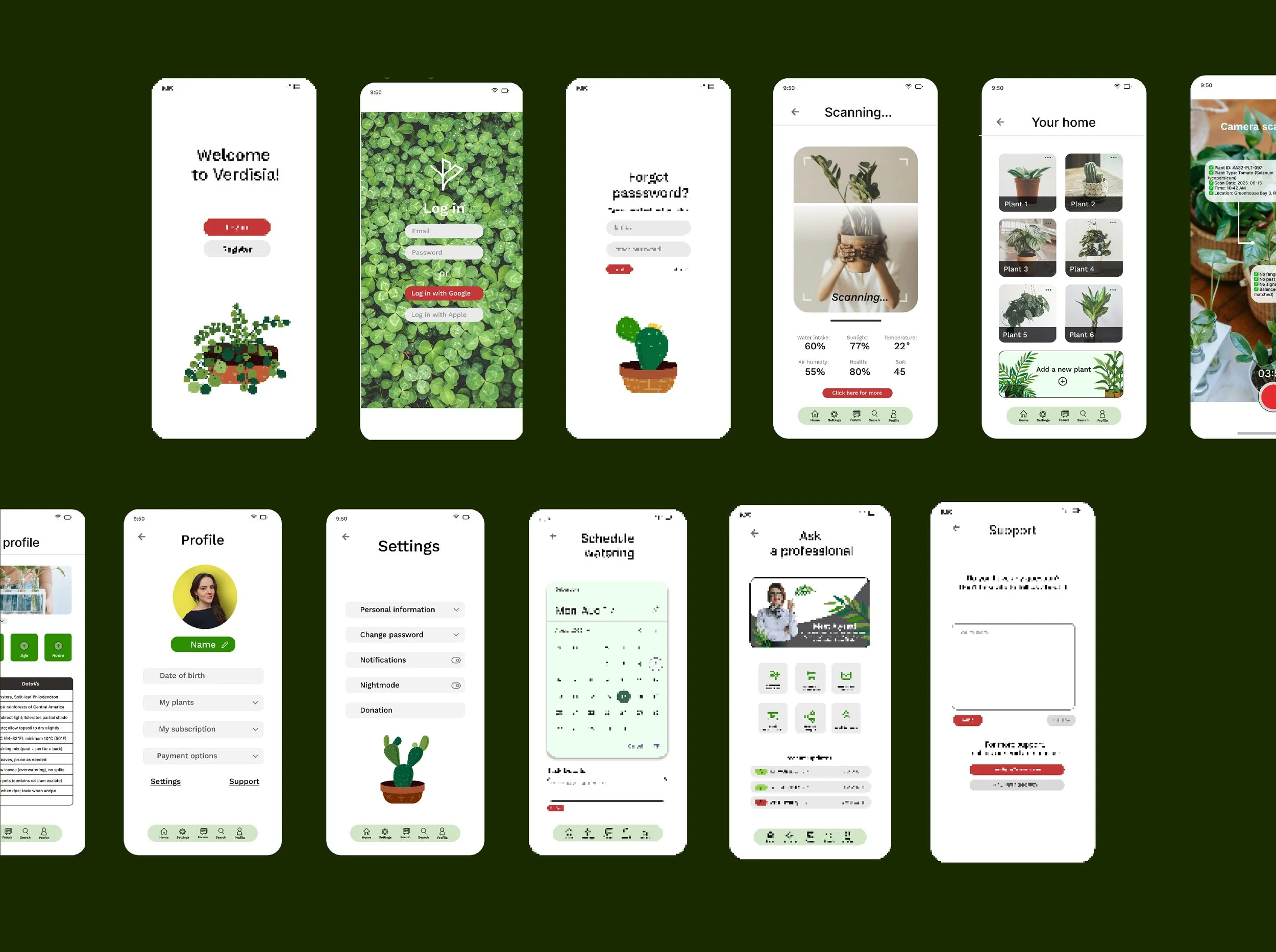
Verdisia
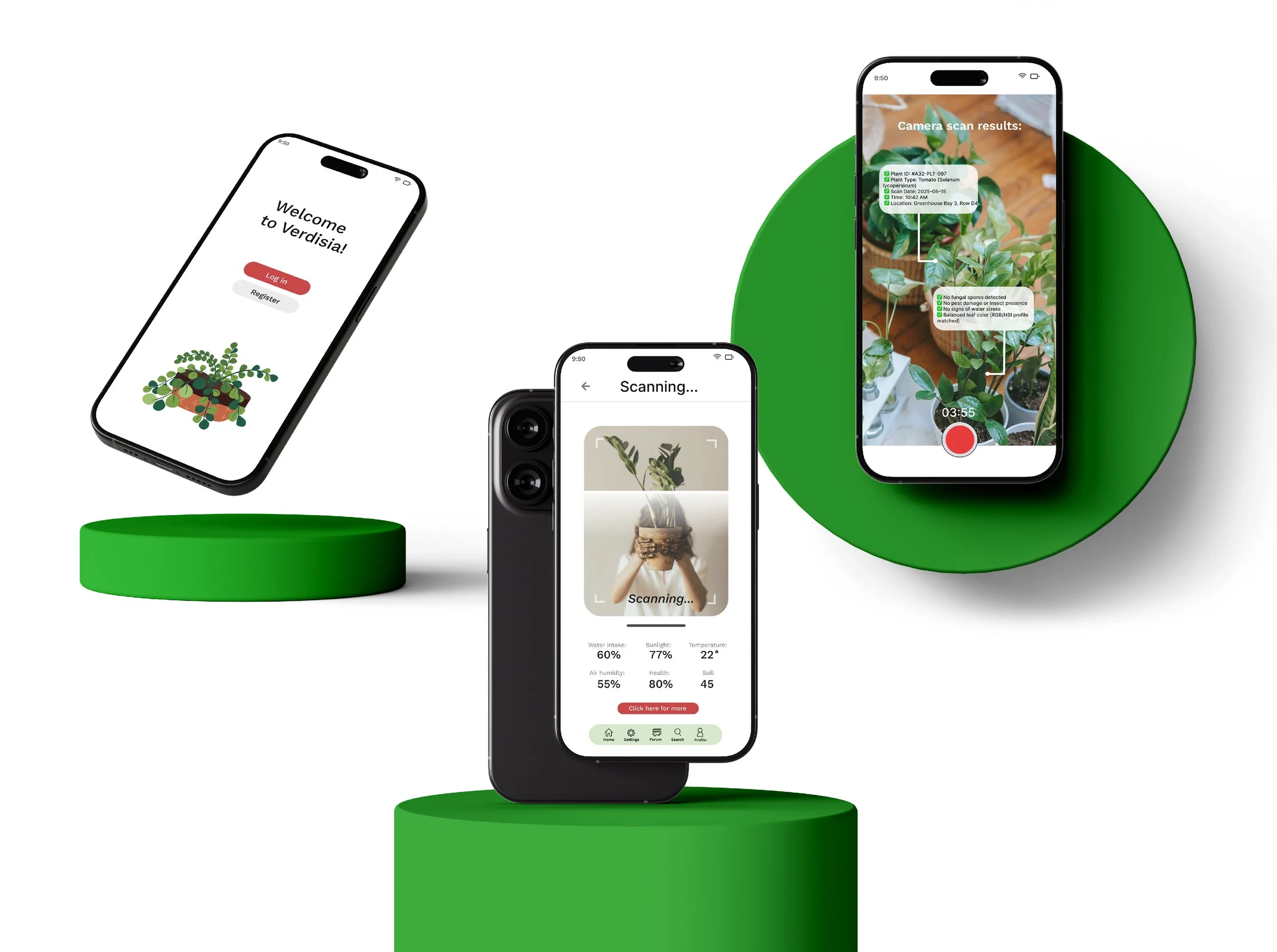
I wanted to explore the world of UI design by creating an app prototype which encapsulates my passion for taking care of plants, connecting people form around the world with it.
At its core, the app offers essential features like watering reminders, a community forum for plant-related questions, helpful articles, and an integrated shop. But what truly sets Verdisia apart is its unique use of charming illustrations and bring the app to life. Users are encouraged to stay consistent with their plant care routines through a rewarding system that unlocks new illustrations, icons, and other visual surprises.
LET’S WORK TOGHETER